Responsiveness is the key feature of ZeGuten plugin. Thanks to it, you can make your website look stunning on any device. ZeGuten provides you with 15 flexible and easy-to-customize blocks, and one of them is a Section block.
Columns are a part of ZeGuten Section block. You can vary their number from 1 to 6. Inside the columns, other elements are put. This allows the developer to never worry about the page layout or spacing options – everything is already organized neatly.
How to add responsive columns in WordPress
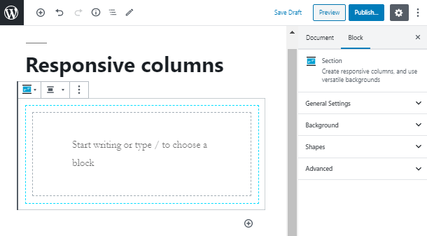
To add responsive columns on the WordPress webpage, you firstly need to add a Section block. Click on the “+” icon, type the block name and pick it.
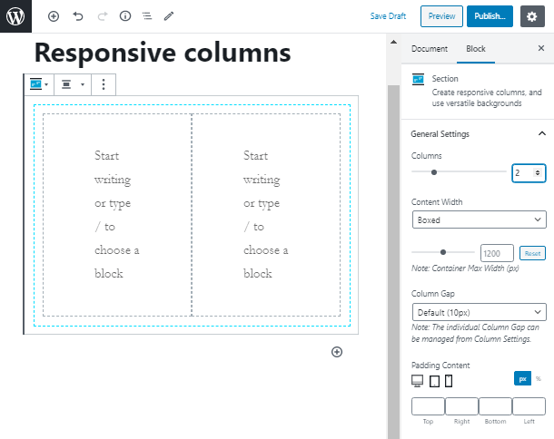
The Section block comes with 1 column by default. To add more columns, you need to go to the General Settings tab and set the needed number. Moreover, in this tab, you can also set some more options according to the columns.
In this article, we are going to explain how you can create different attractive and flexible layouts with responsive columns in WordPress. To start working with an element, you should click somewhere on the column area.
Similarly to the Section block, here you also have 4 tabs with a bunch of settings. However, to make your page responsive, you only need two of them. In the Spacing tab, you are able to set margins and paddings in pixels or percents for your desktop, tablet, and mobile phone.
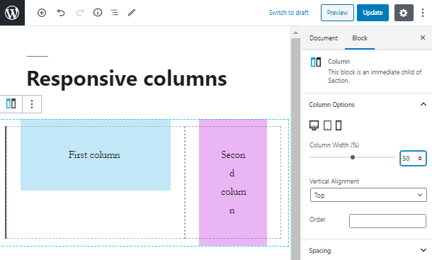
One of the most useful features of the column elements is that you can regulate the column width in percents. Firstly, let’s set the background for both columns and add simple paragraph blocks inside them.
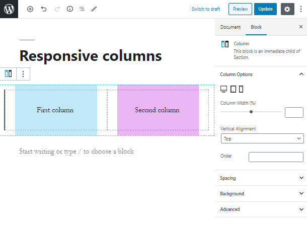
Take a look at the Column Width option. Let’s give the first column 65% on the desktop device. The second column will automatically “take” the remaining space, which is equal to 35%. In case you have more than 2 columns, the remaining space will be distributed equally among all columns.
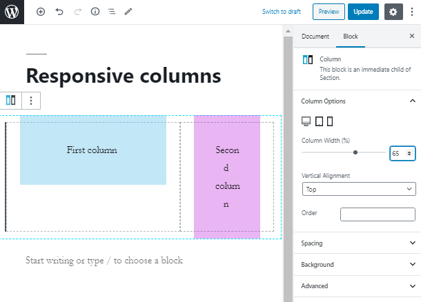
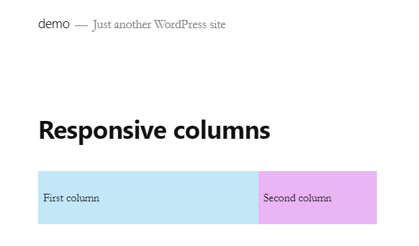
Here you can take a glance at the live example of how your webpage will look on the desktop device after you set this option. As you can see, the first column is much bigger than the second one.
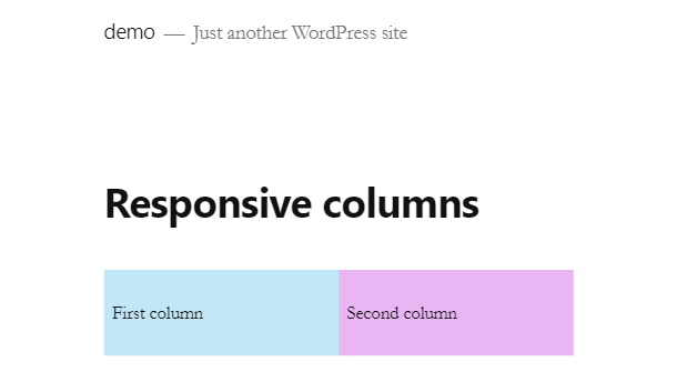
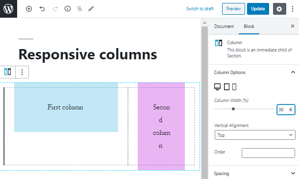
Now let’s move to the administrator dashboard of your website and set the column width for the tablet device. In such a case, we will set the width of the first column as 50%, which means that on your laptop the columns will be equal.
That is how your columns will look on any laptop device. In case you want to add a responsive gap between the columns, you may use the spacing options in the tab below.
As the last step, we will create a responsive column WordPress layout for mobile devices. Remember, that you can set any width from 1 to 99 percents. The value is specifically set in percentage because the column elements are put in the Section block, which already has a certain width.
All done! Now you know how to create responsive columns WordPress layouts and make your website user friendly on any device. Subscribe to our newsletters for more useful tips!