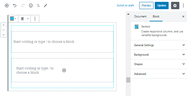
In this quick overview, we are going to talk about WordPress responsive columns in ZeGuten Section block. This block will allow you to build any webpage because it was made as the parent element for any other block.
You are able to add a responsive column, shape background, or video background. With ZeGuten Section block, the process of enriching your website with original backgrounds comes effortlessly.
Sections are powerful instruments to build attractive designs concerning an image background, or even gradients and shapes.
Adding a Section Block with Responsive Columns
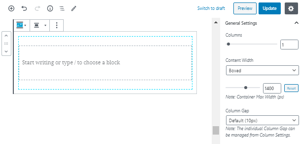
To add a Section block, you need to click on the “+” icon and select it. The block consists of at least one Column element, however, the default section comes with two columns.

Also, in the General Settings tab, you can set a bunch of properties according to the size and spacing. We will pick 1 column to showcase and choose the width of the content as boxed.
Here you can also set the container maximum width in pixels. As well as the individual column gap. However, this very property you are able to set in while customizing responsive columns.

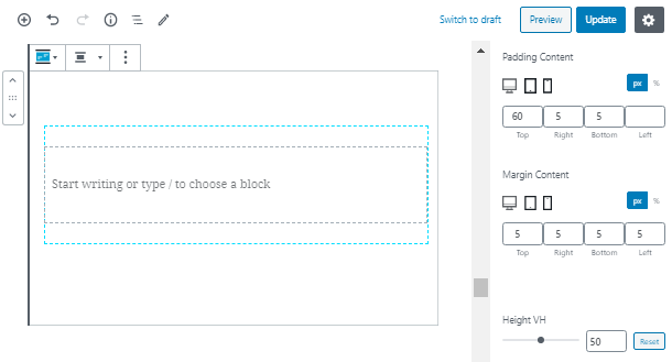
WordPress responsive columns in ZeGuten Section Block can be as height as you want. One of the key features of the block is its responsiveness. You are able to set margins and padding on desktop, tablet and mobile phone.
In this tab, you can also set the vertical content position, add a border and its radius.

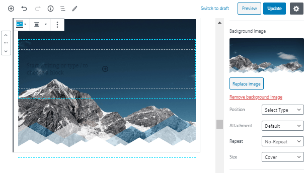
Customize the Section Background
The design possibilities of the Section block are really limitless. In the Background tab, you are able to set an image for your background and even set a text color for any text element inside the section.
However, if you want to make your background more entertaining, add an image. Set its position and pick the attachment. You can also decide whether you want an image to repeat and set its size. Moreover, if this is not enough for you, add a video background for WordPress block.

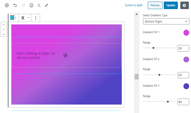
Don’t want anything to disturb the visitors from the text? Not a problem! Add a gradient for block by picking one of 8 gradient layouts. Set ranges and colors and fill your section with content.

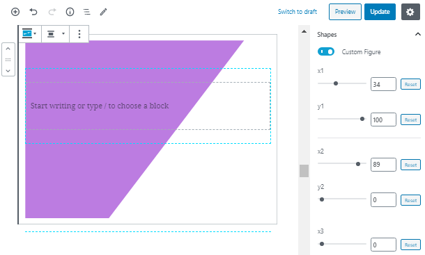
One more stunning feature of the Section block is the ability to add shape background. Enable the custom figure and set 8 positions: 4 for X and 4 for Y. With the help of this tool, you can make an unusual and eye-catching block with rectangle, octagon or custom shape as a background.

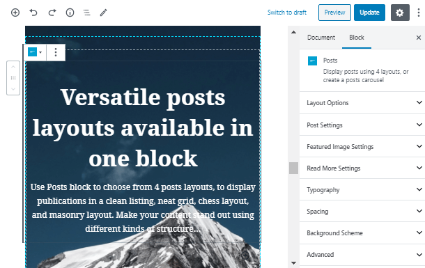
Finally, when all the design solutions are made, you can any content you want inside the responsive columns, from Posts block to pricing tables or blurbs.

Congratulations! Now you know how to add and customize a Section block! Learn more with our useful tutorials and overviews by subscribing!