There is an amazing decision for companies to showcase the results of their work on their own websites. It attracts clients and helps them to check how professional your projects are. Image comparison for WordPress will help you to display Before and After states in the most engaging way.
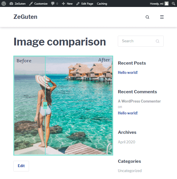
Meet the Image comparison block from ZeGuten collection. The visitors can move the divider and see how the image has changed after you worked with it. Choose two photos, customize the borders, and enjoy the result you get. It is a very interactive block which is liked by many people.
Check the number of settings and options that this image comparison for WordPress includes. You are free to enter titles and descriptions you want, set borders and spacing, drop shadow, choose the background color and arrows size, etc. Stylize your block according to your needs and make it suit your website design. So, let’s not waste time and explore the peculiarities of working with this block.
Work with the Image Comparison for WordPress on the Page
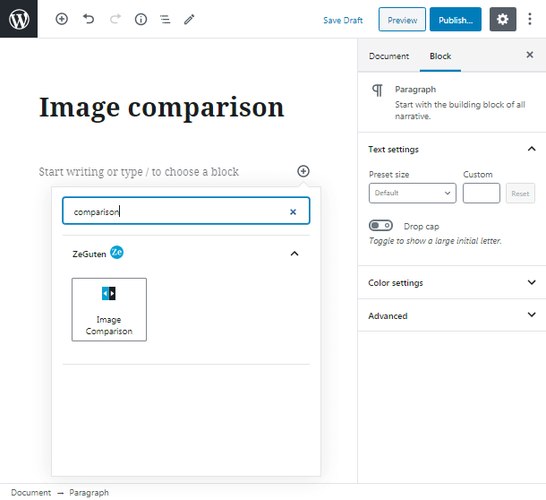
To add the Image comparison block to your page you should open the needed page in Gutenberg editor, click on the “+” button and find the comparison block.
You can enter the block name in the search field of the appeared window or simply type the name of the block, beginning with “/”, in your working space.
When you find the necessary block click on it to paste it to the working field.
Once you have added the block you will see its settings in the right sidebar. First, you should do, is to set the image before. You can upload it from your PC or add it from the existing media library.
Then write the title and description (if there is a need). In our case, we didn’t use descriptions. You can also change the typography and text color, align the content, set paddings, etc.
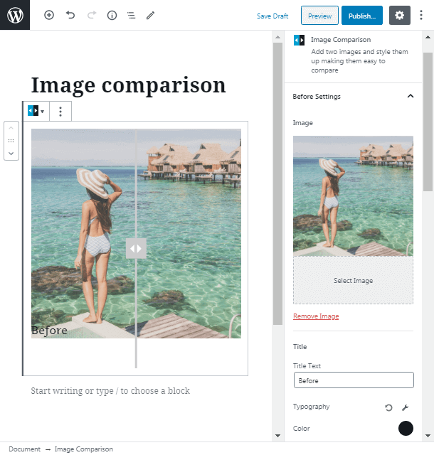
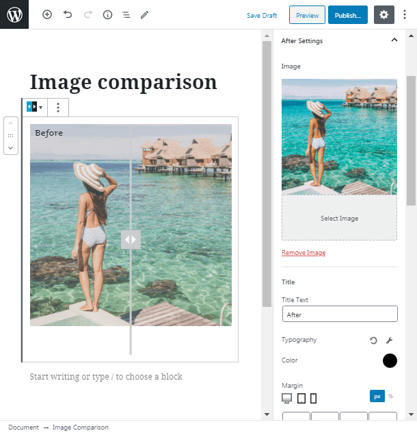
Image Comparison After Settings
Then repeat the actions from the step above with the After Settings tab. It is recommended to use the same options for the before and after blocks for the better design.
General Settings of Image Comparison Block
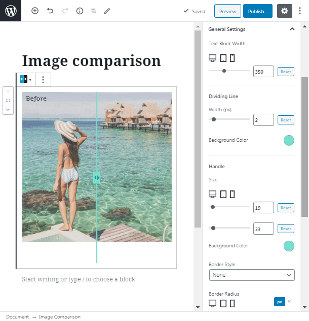
In the General Settings tab, we will change the dividing line width and color to make it more fit our image. Handle settings will be also changed according to your tastes.
We didn’t use borders, so we miss these fields. Cross to the handle arrows to improve their look. Change their size and color too.
Block Background
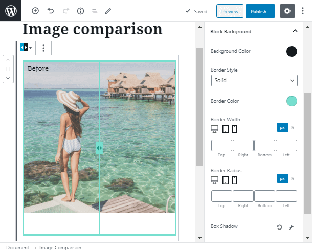
Block Background tab of our image comparison for WordPress allows you to set the background color and borders for the whole block. You can also choose the style of the borders from several pre-made layouts. Drop shadow if you want to add more uniqueness to the block.
Block Spacing
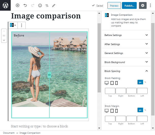
The Block spacing tab is for changing the block space. You can attune it if you want.
Advanced Tab for Your Own Style
In addition, if you want to add your own style class you can use the Advanced tab. Choose the needed CSS class and enter it in the special field in this section.
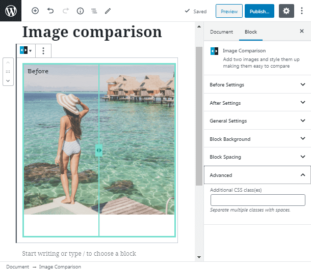
Let’s check the result we got. Our image comparison for WordPress looks great, isn’t it? The colors fit together and create a good combination. Try your own comparison and impress the visitors with the functionality of your website.
To sum up, Image comparison WordPress block from the ZeGuten collection is fool-proof and ready to boost your webpage. If you wondering how to apply the plugin with blocks, pay your attention to the Gutenix subscription, purchasing which you will catch the whole set of products that perfectly work together.
